Shooting to a theme is one way to keep your mind quietly alert to photographic opportunities. In the context of photography, a theme is simply a coherent set of subject matter. A theme could centre around a set of objects, (Doors, Abstracts, Hands) or it could be a concept (Contrasts, Sorrow, Joy, Indifference). Photographing to a theme doesn’t mean heading out to shoot examples of your theme to the exclusion of all else (although you could); for one thing, good examples of a theme don’t always present themselves every time you are out shooting. Instead, these are ideas that stay in the back of your mind, and that you shoot as opportunities arise. Having them in the back of your mind helps you to be mindful while you are out, always looking for images that fit your chosen theme(s)
A few simple themes I work on are “Doors”, “Complementary Colours” and “Colour Harmonies”. Sometimes you get lucky, and more than one theme is present in the same image.
I’m always intrigued by the doors of private homes in Europe. Doors and front porches often seem to be vehicles for personal expression, to difference one’s home from your neighbour. Here are two examples from Provence.
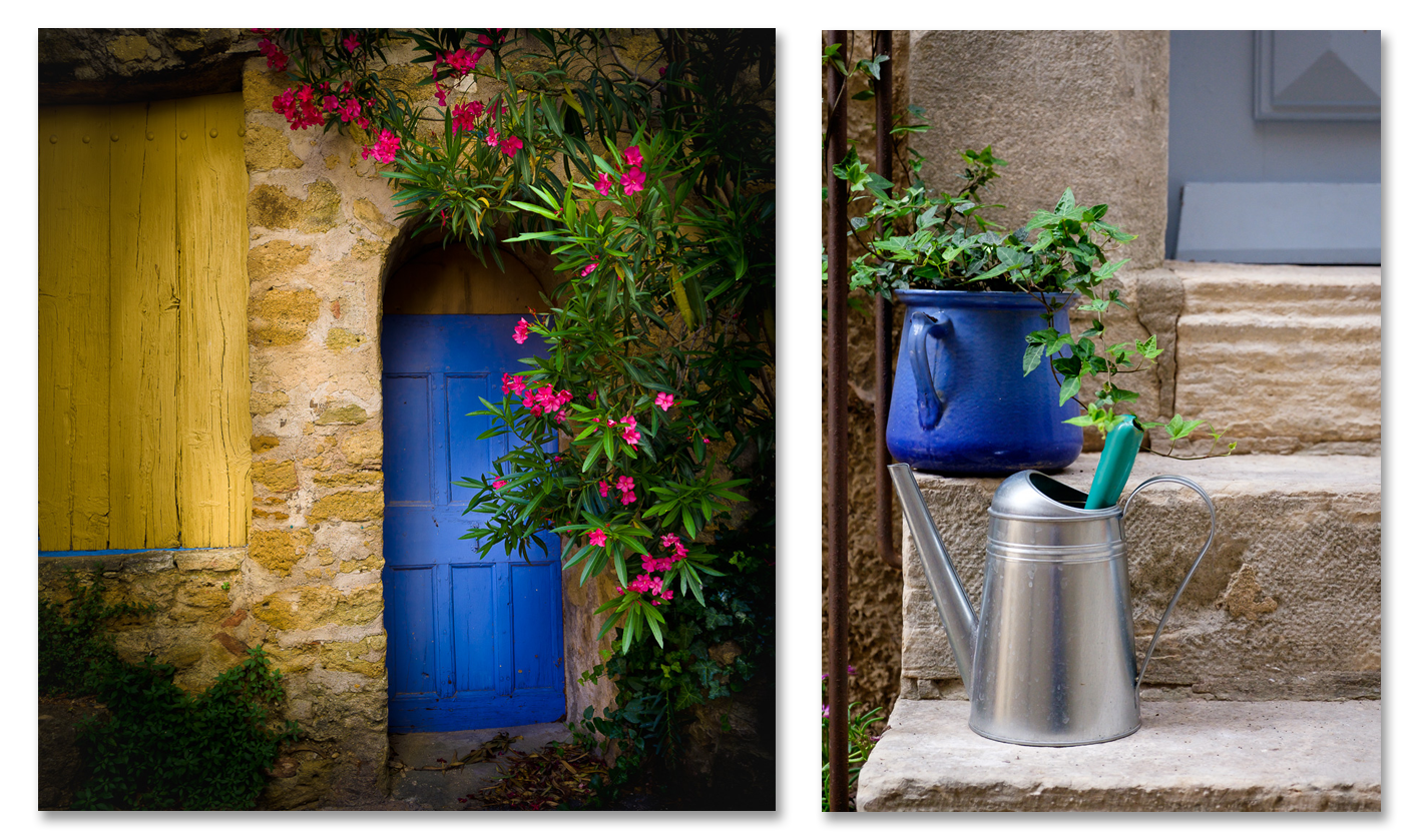
Aside from being eye-catching, these two doorways also represent examples of complementary colours in the first, and colour harmony in the second. Colour complements and harmonies is another theme I like to look for.
Complementary colours exist on opposite sides of the colour wheel, in the RGB world of digital colour, examples include red-green and yellow-blue. When they occur next to each other they reinforce each other, increasing the impact of both.
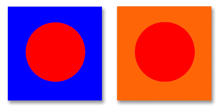
Harmonious colours exist together on the same side of the colour wheel, examples include blue and green, or yellow and orange. Harmonious colours placed next to each other tend to reduce the impact of each other. The images below show the effect of this. Which of the two circles within each square is the most pure and saturated red? The answer is, “Both!” Placed next to a blue background, the red circle appears more saturated. Placed on an orange background the impact of the red circle is diluted, and appears less saturated (in fact it almost appears to take on an orange cast)
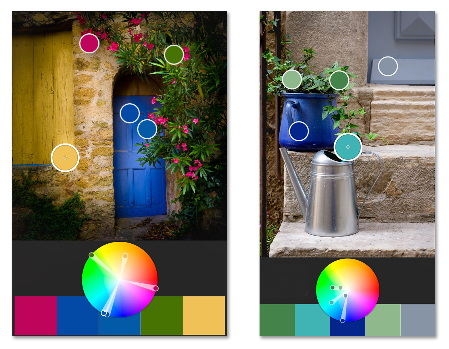
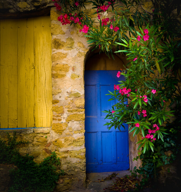
In the image on the left, the magenta flowers (which have a large dose of red) and the yellow shutter sit on the opposite side of the colour wheel compared to the blue doorway. Their presence next to each other makes each appear stronger than they would on their own. Complementary colours also impart energy and excitement to an image.
In the image on the right, all of the principal colours exist on the same side of the colour wheel. This is an example of colour harmony. Rather than reinforcing each other and imparting energy, harmonious colours in the same image impart a sense of calm and tranquility, or warmth and comfort.


Thoughtful discussion is welcome. Comments may be moderated for clarity and relevance.